Scale Navigator Dashboard
Role · Product designer & developer
With · Many collaborators over eight years, credited below
Platforms · Web · iOS · Android · macOS/Windows · VST3/AU
A map of harmony you can compose and perform with. One surface controls the harmonic state of every plugin, instrument, and player in the session.
Problem
When I compose, I'm weighing chord-scale relationships: what melodies fit inside what harmonies, where the bass goes, how to voice things. I can stop, try a few options, and hear where they lead.
When I improvise, I have to decide in real time.
What if the interface where I make that decision is itself a map of where harmony can go?
That's the idea behind Scale Navigator Dashboard: a network of 57 scales where neighbors differ by only one note, so the nearby possibilities are always in view. The constraint: it had to work while someone was making music, not after.
The Dashboard today. The center is where you are; everything touching it is one note away.
Insight
It started with Dmitri Tymoczko's scale-network research: figures where each seven-note scale sits at the center of every scale one note away, and an analysis of a Debussy prelude as a walk through that network. Here was a geometrical description of a famous harmonic language, and it read to me like a design spec: make it interactive, and then hand other people the keys.
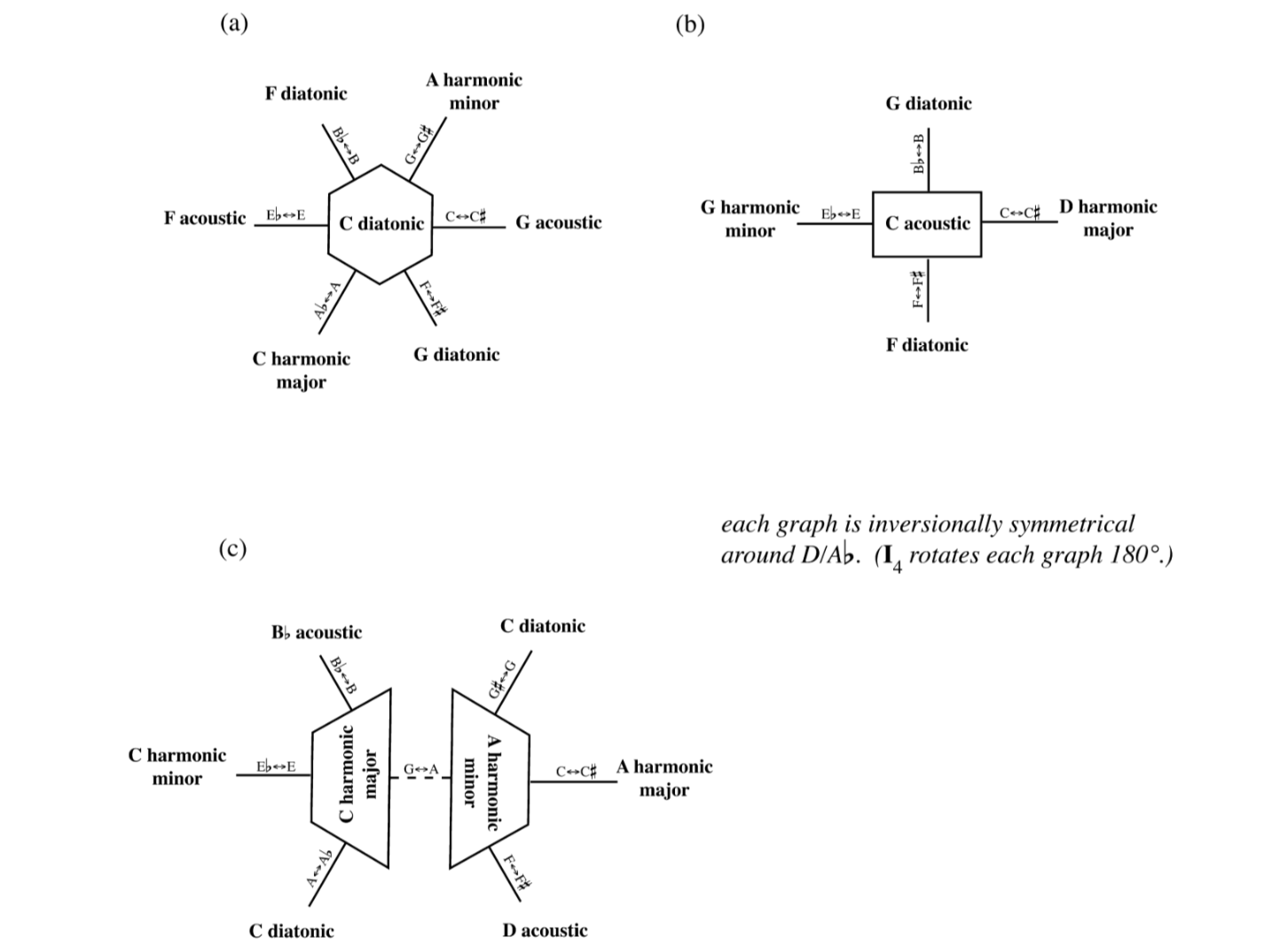

The figure I adopted almost verbatim, beside the mobile Navigator today.
Prototype
Keys 1 through 6
The first build, summer 2018, was a p5.js sketch you steered with the number keys: press 1 through 6 to move to a neighboring scale, and the whole network re-orbits around your new position. I was a music tech MFA at CalArts who could barely program, so two programmer friends paired with me twice a week.
Navigation in motion: each keypress re-centers the network on the chosen scale.
The prototype seeded my installation work at CalArts, starting with Modal Intersections, went in front of singers at INTERSTICES, and the research behind it became my MFA thesis and a paper at NIME 2019.
Modal Intersections: the prototype driving player pianos in its first year.
I surveyed the INTERSTICES performers afterward. One wrote that "a highlight indicating which note has changed would be helpful," a request that grew into its own project, Notation Anticipation. Another wrote that the music came out sounding "more like a scale exercise." That one stung because it was accurate: the system could move through harmony, but it couldn't yet make anything worth keeping.
Iteration
An instrument before a product
Through 2019 and 2020 the sketch grew into an instrument. A chord generator turned each scale into playable harmony, ranked by voice-leading smoothness. The visual language settled into something I still use: shape encodes how a scale connects (hexagons, rectangles, and parallelograms for the different scale classes), and color encodes the root. Controls appeared for allowable root movement and a smoothness slider, and Web MIDI sent the output through an IAC bus into a DAW: harmony was already trying to live at the center of the session.
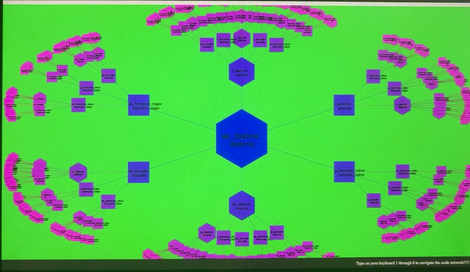
The 2018 prototype; bottom right, the entire interface manual.
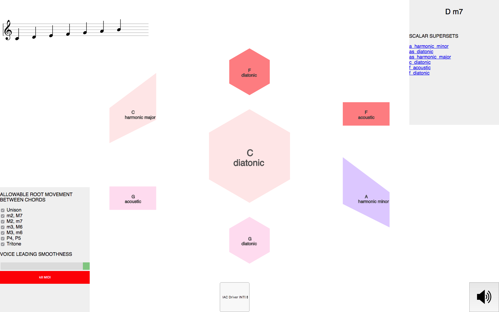
2020: the smoothness slider and MIDI routing that later became the plugin.
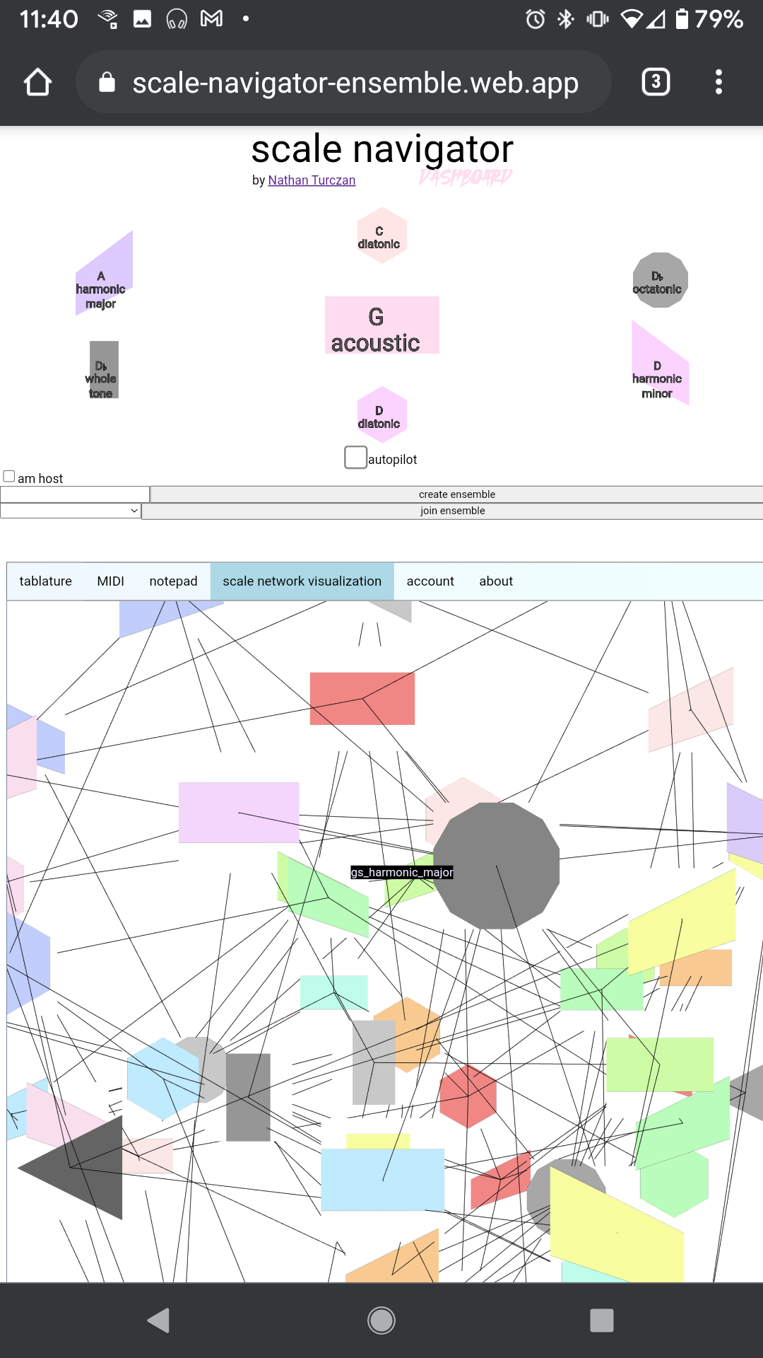
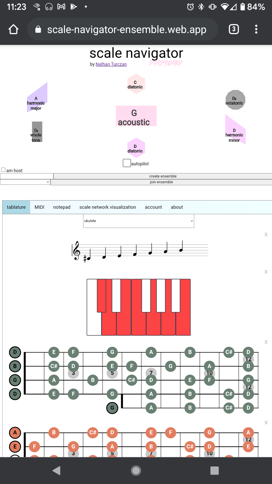
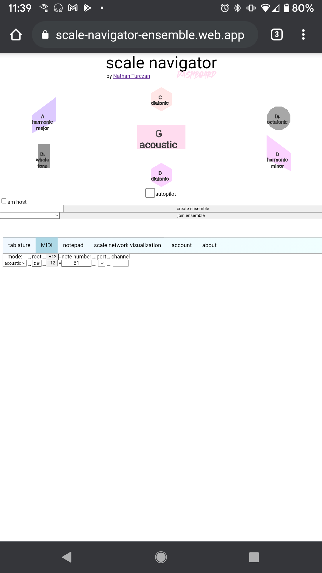
The vanilla-JavaScript app, 2021: network, tablature, and MIDI, all there before the rebuild.
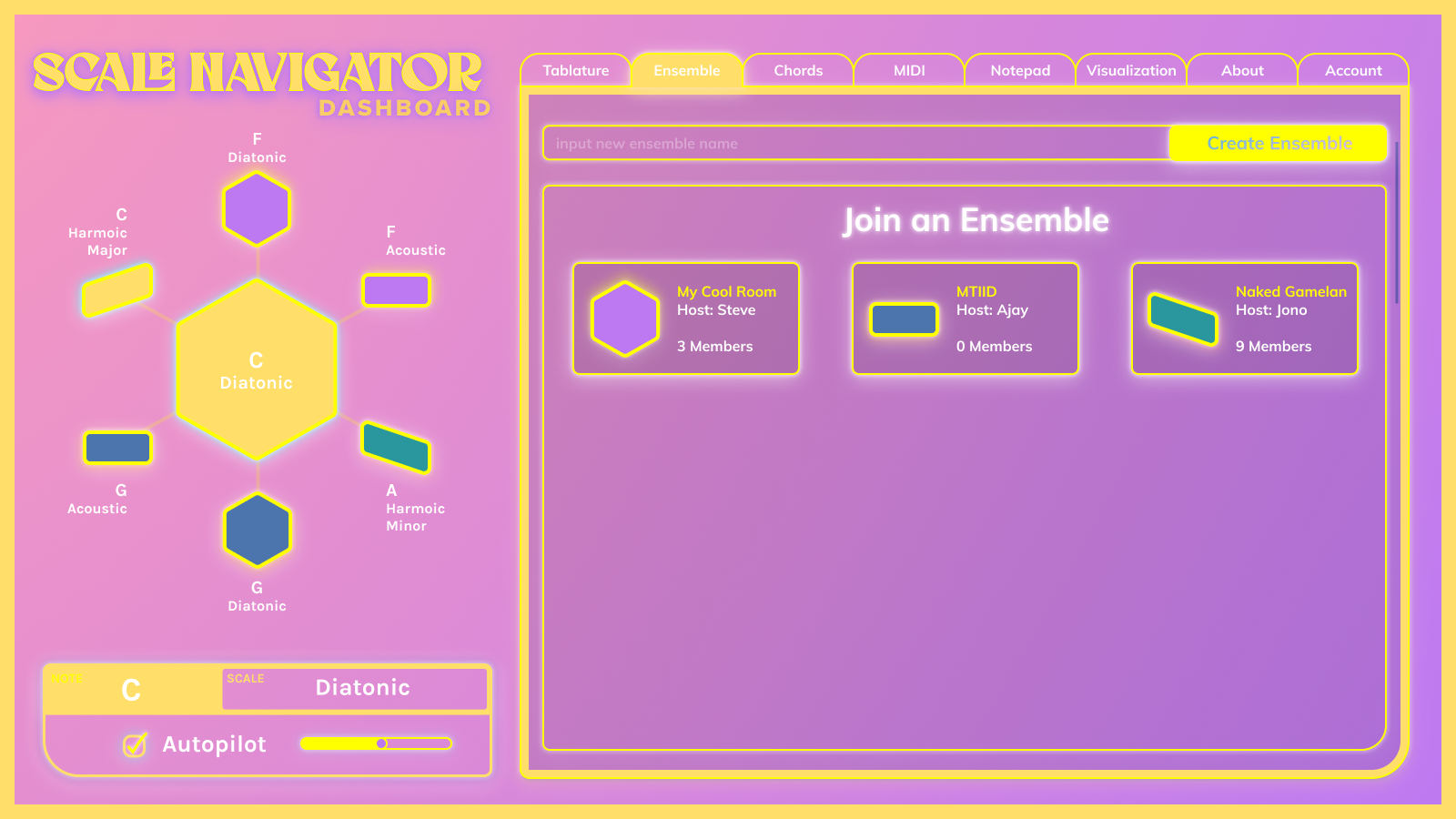
The first outside UI direction: pink, playful, ensemble-first.
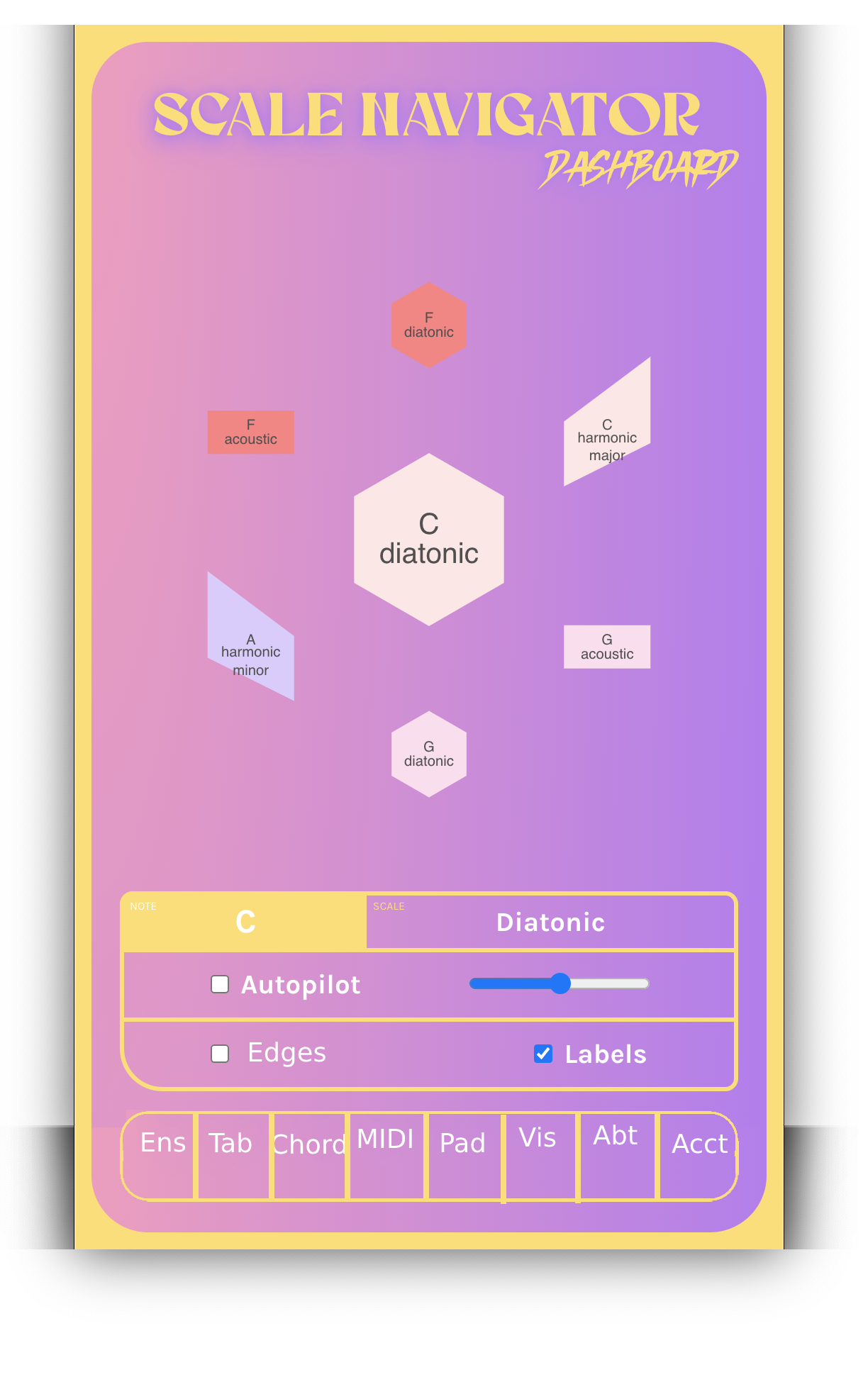
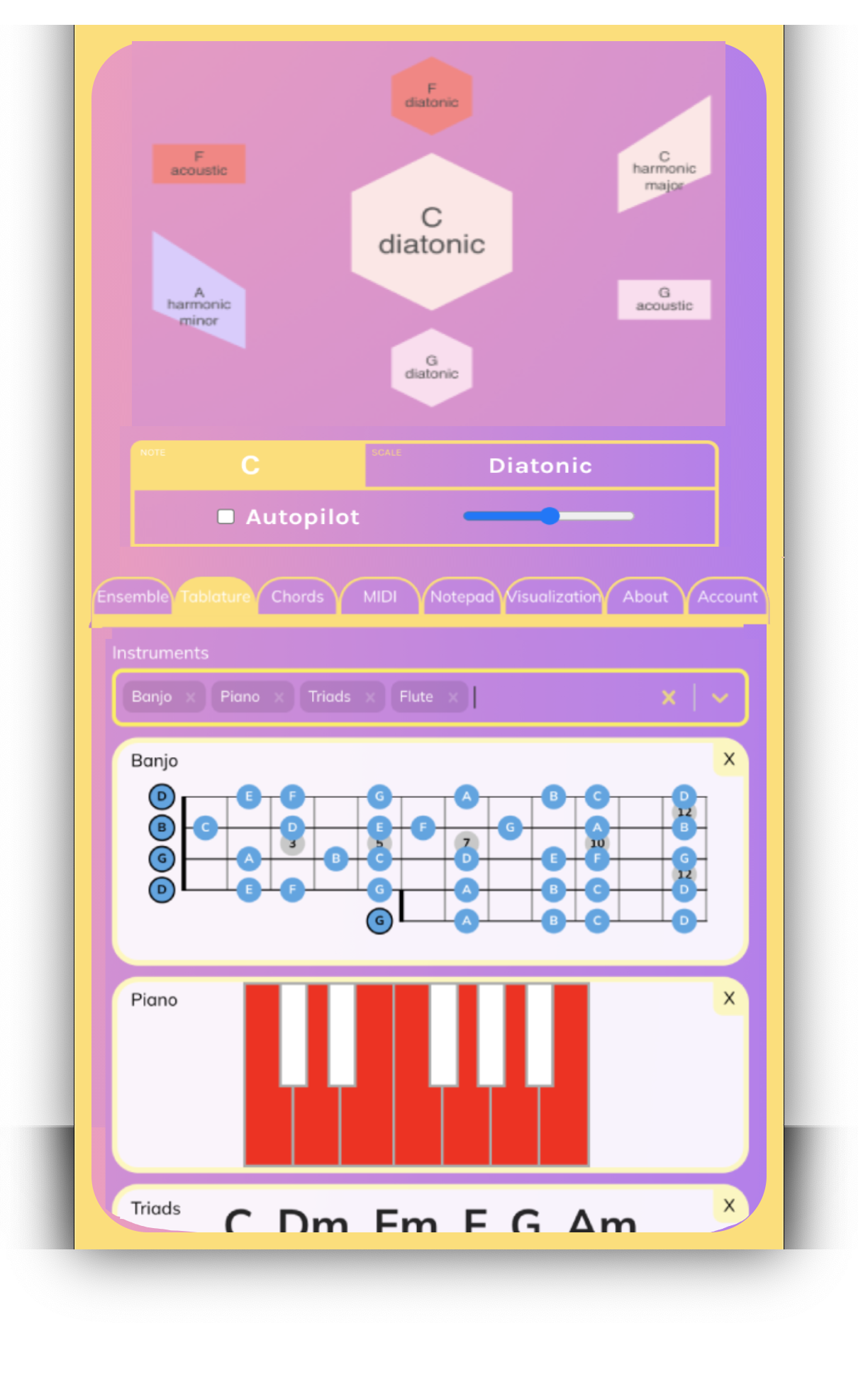
The pink direction on mobile: Navigator and Tablature wireframes.
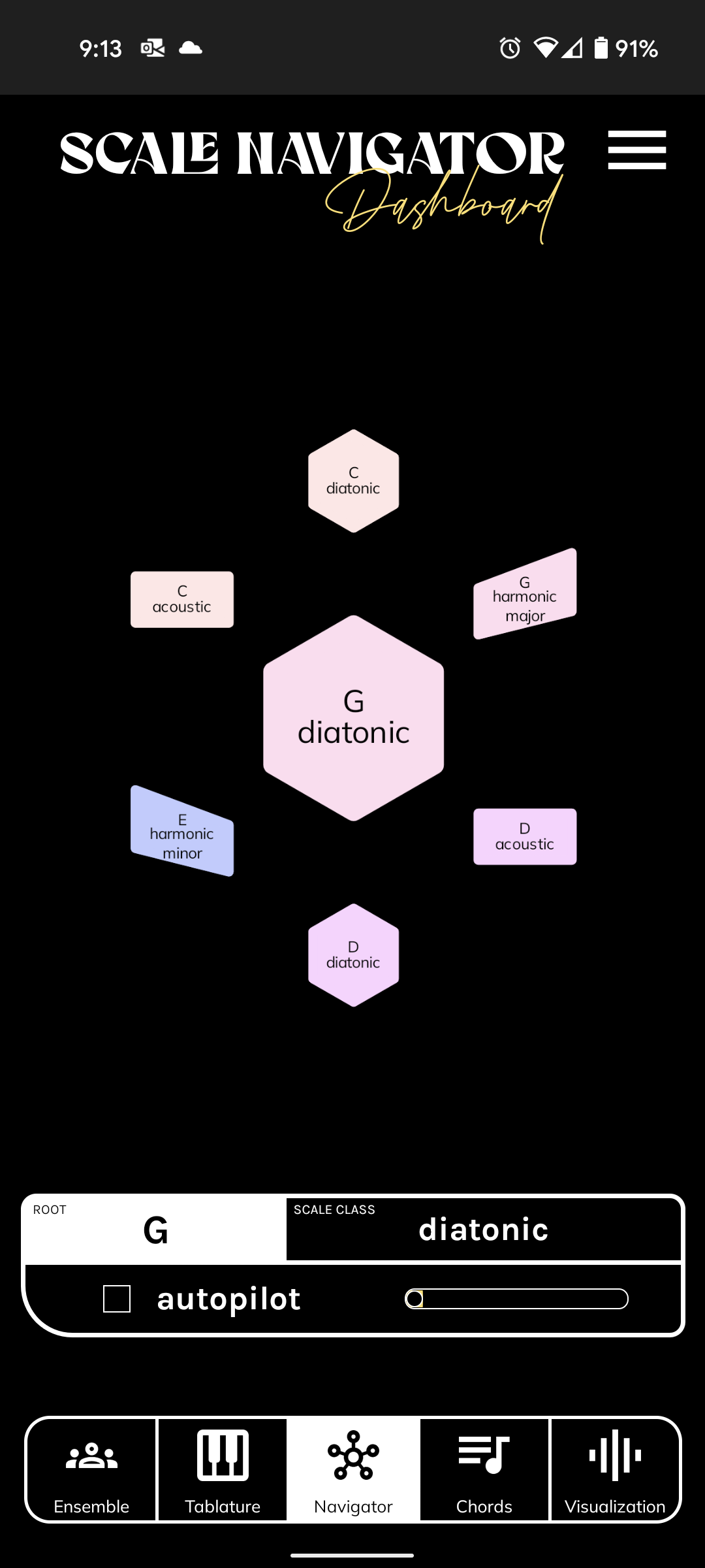
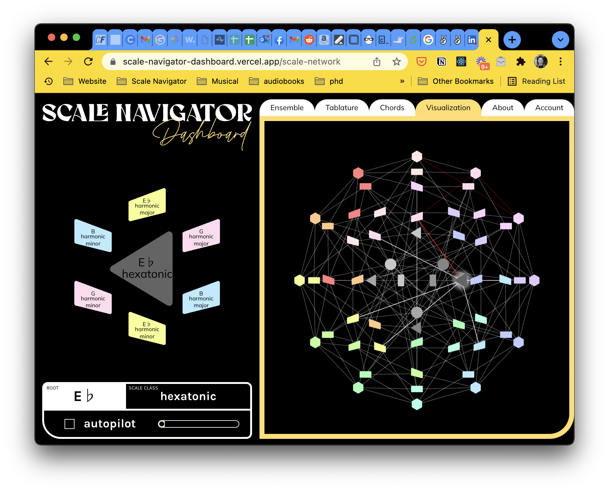
The black-and-yellow direction wins. Below the network, the info box tracks only the scale.
Every build through this period shared a flaw I only fixed in the modern era: the info box, the readout of the current harmonic state, reported the scale and nothing else. In Tymoczko's hierarchy:
- voices move inside chords
- chords move inside scales
- scales move inside the twelve-note chromatic universe
Scale and chord are the two levels the interface has to pin down, and the info box was silently dropping one of them. Today's builds show both, side by side, on every platform.
Going all-in
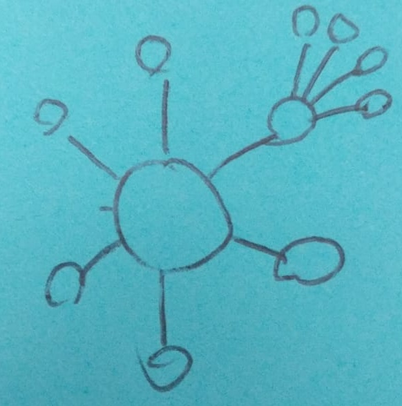
The interaction spec, complete.
When the pandemic took my day job, I went all-in on the tool and rebuilt it as a React app. The interaction spec fit on a Post-it: your scale in the middle, its neighbors around it, and one neighbor already unfolding into its own neighborhood.
Capturing harmony
At the time I was contracting at Output, where Arthur Carabott led interface design. I cold-emailed him asking for a critique, and on the call he gave me two pieces of feedback that took years to fully address:
"Once I've found a chord I like, I want to be able to actually learn that, or save it. At the moment it is very easy to just keep clicking and lose what I had."
"It's the difference between someone demonstrating something on stage, vs a teacher helping you learn it."
The tool was good for wandering but bad for composing: you'd stumble onto something beautiful and then click again and lose it.
Arthur's two questions, how do you capture what you find and how do you learn from it, became the design thesis for everything Scale Navigator does. The Sketchpad, shipped five years later, is the answer: you explore the network, find something you like, and drag it into a progression you can keep, replay, and learn from.
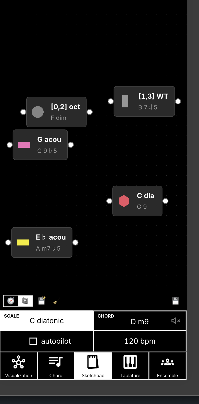
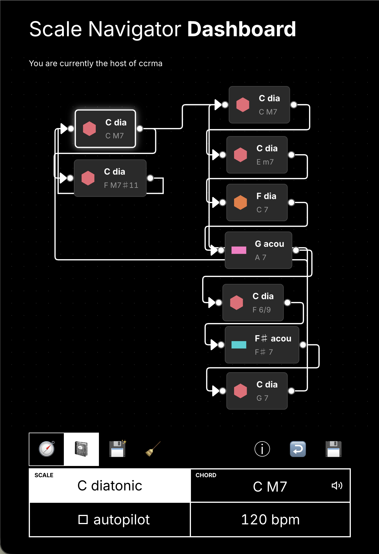
The Navigator is for exploring ideas; the Sketchpad is for keeping them.
Visual identity
A 2021 brand engagement produced the pitch-class color system, built on the circle of fifths; black-and-yellow won over competing directions. I kept the script "Dashboard" wordmark over the designers' objection, a call later critiques reversed.
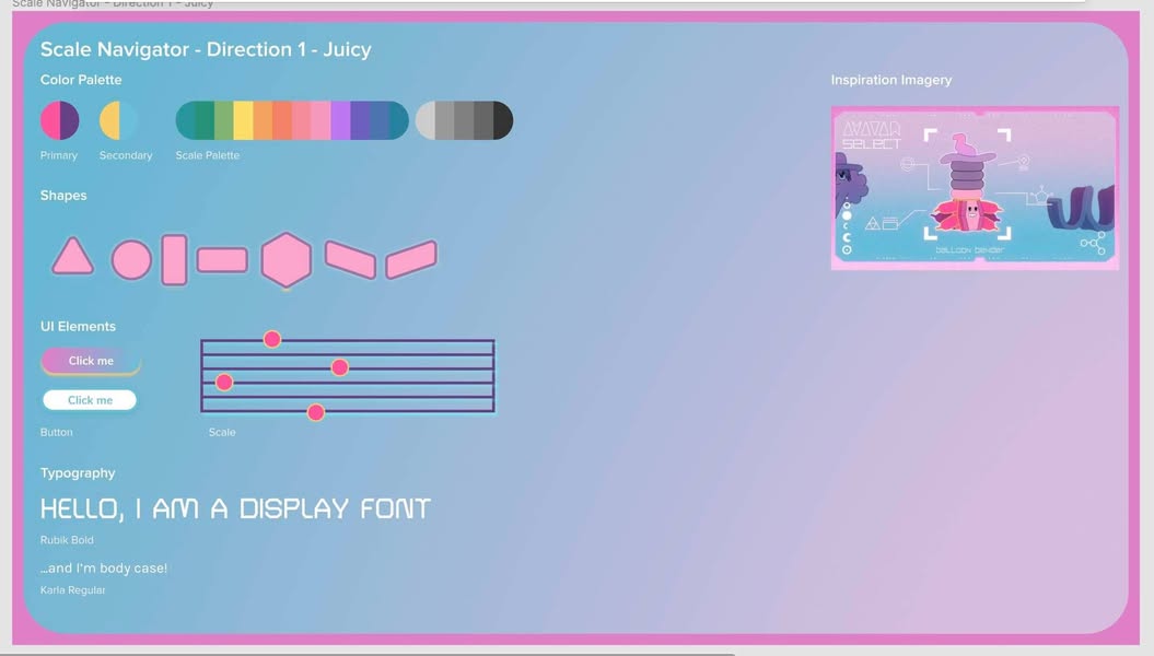
One of the competing brand boards: "Direction 1 - Juicy."
Mobile came from pen sketches of how the network could squish onto a phone.
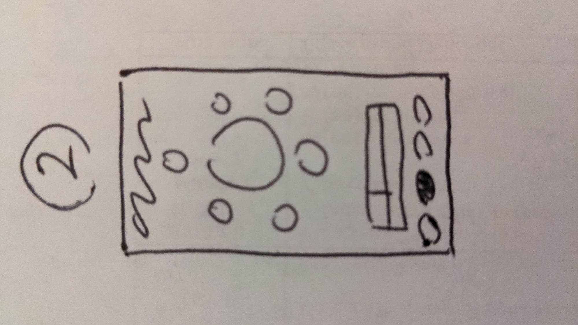
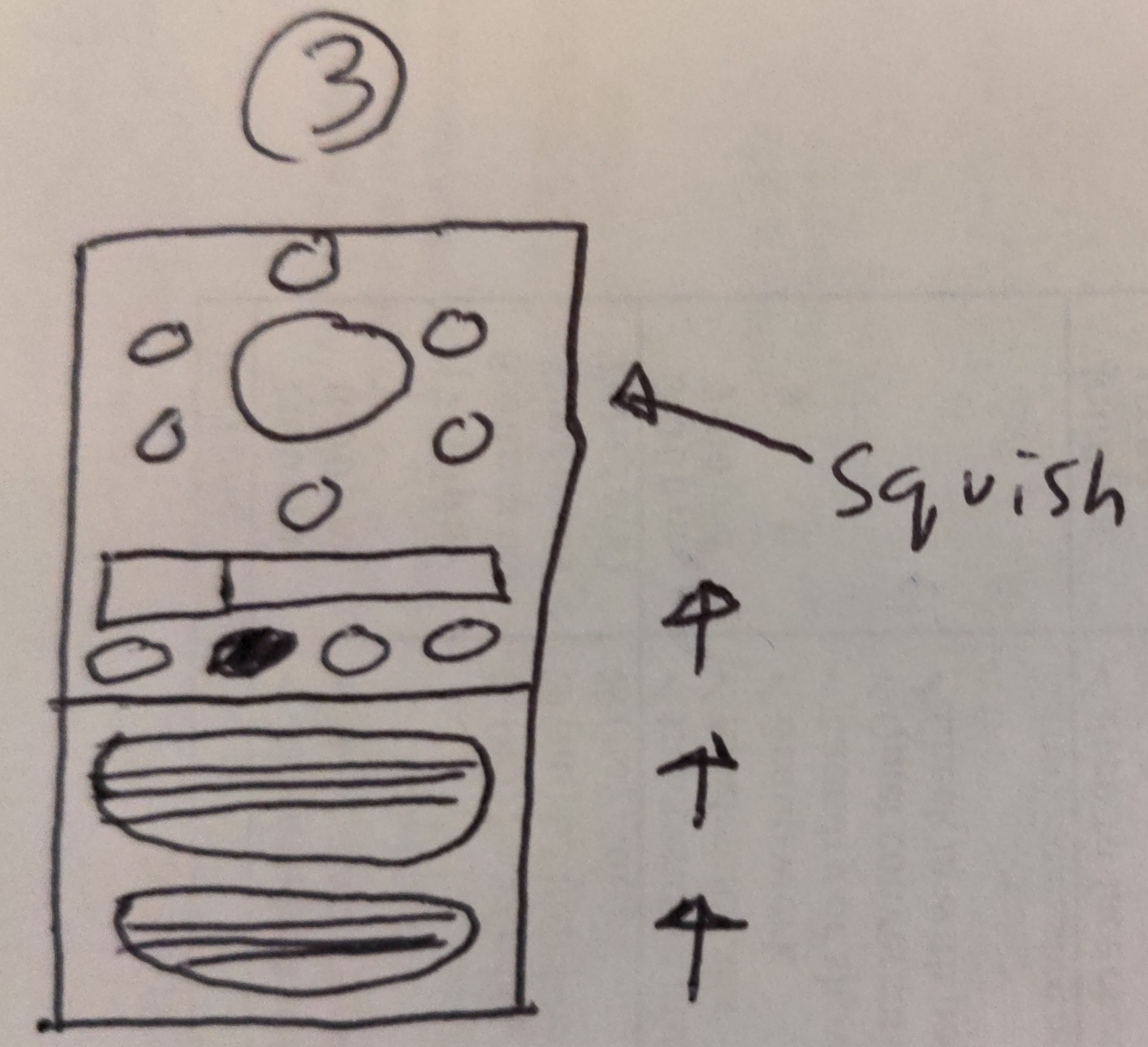
Notebook pages working out the squish.
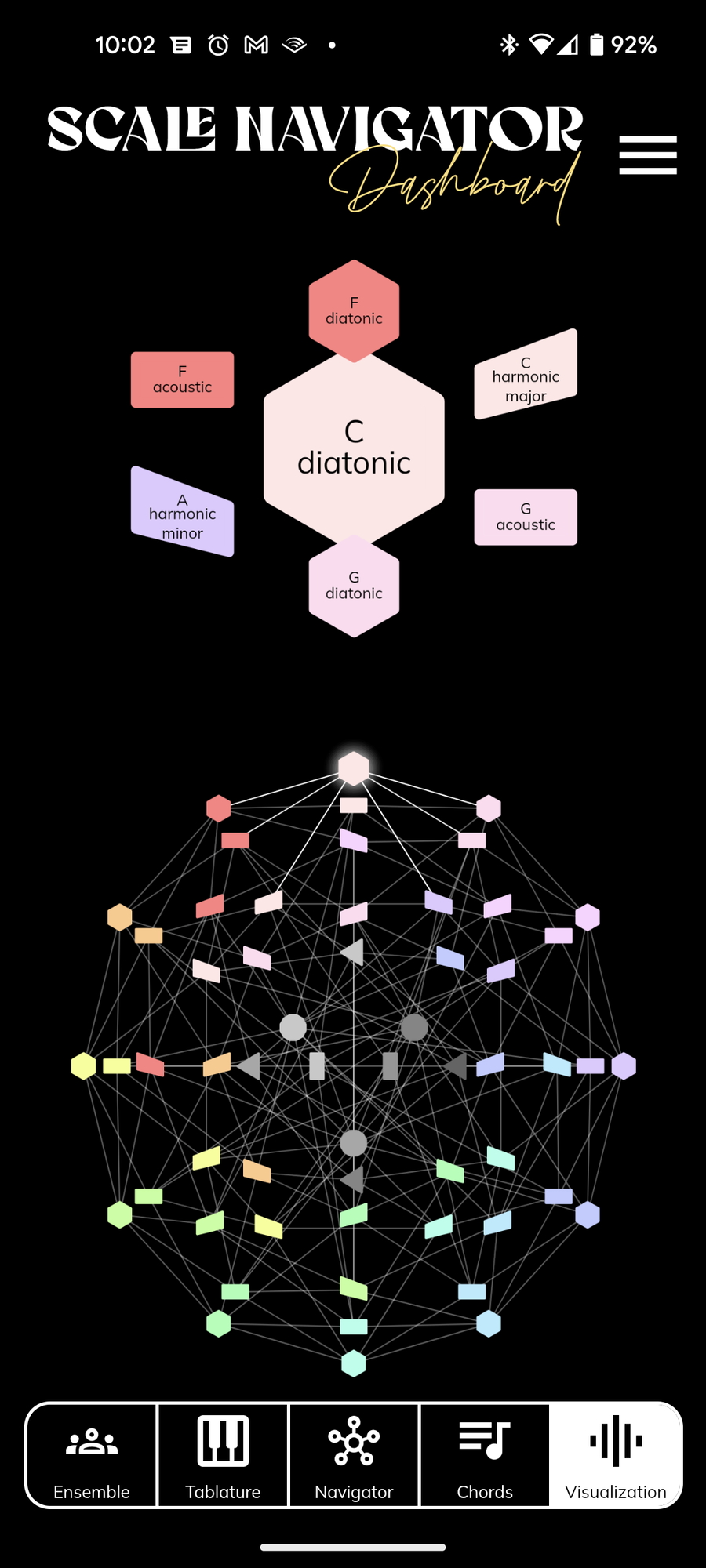
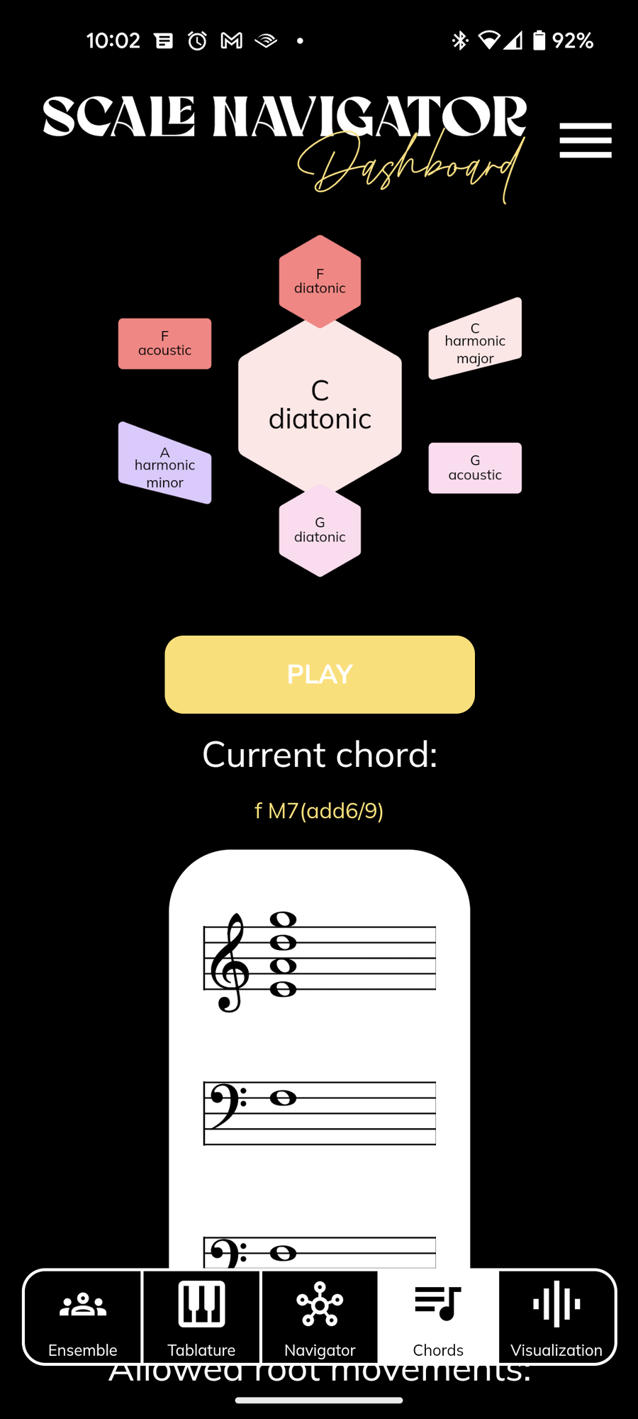
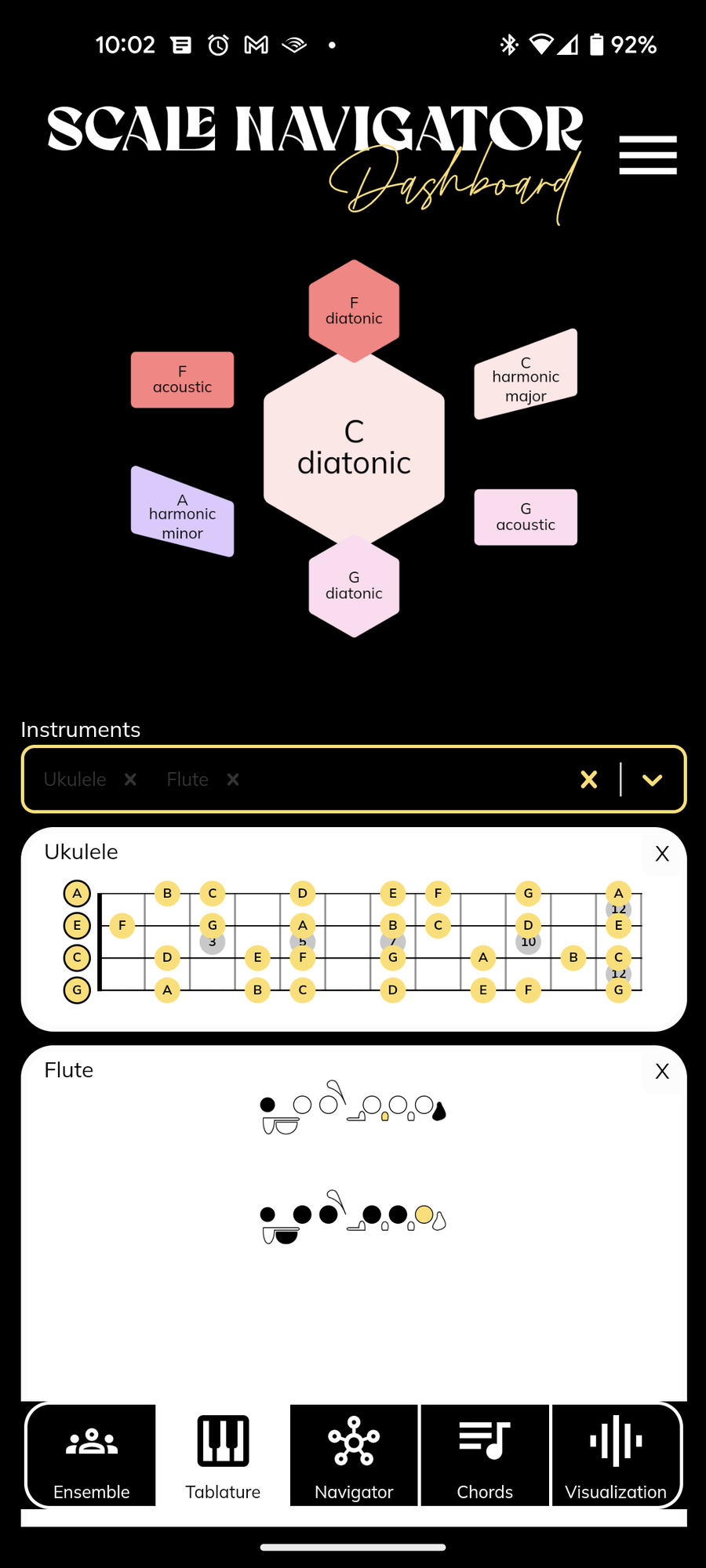
The shipped Android build: the same layout, squished to one thumb.
Failure
The feature that took four years
Chord MIDI routing, the ability to send the chords you click to any port, channel, and octave, was specced in 2021: a pen wireframe, photographed and handed off. The routing UI shipped within 48 hours, but only scale-note output ever worked behind it: the dropdown was supposed to offer every MIDI type the system knows, and for years it routed scale notes and nothing else. I hired several engineers against the problem, and none of that work merged. I fixed it myself four years later, right after leaving my job to build the product solo.
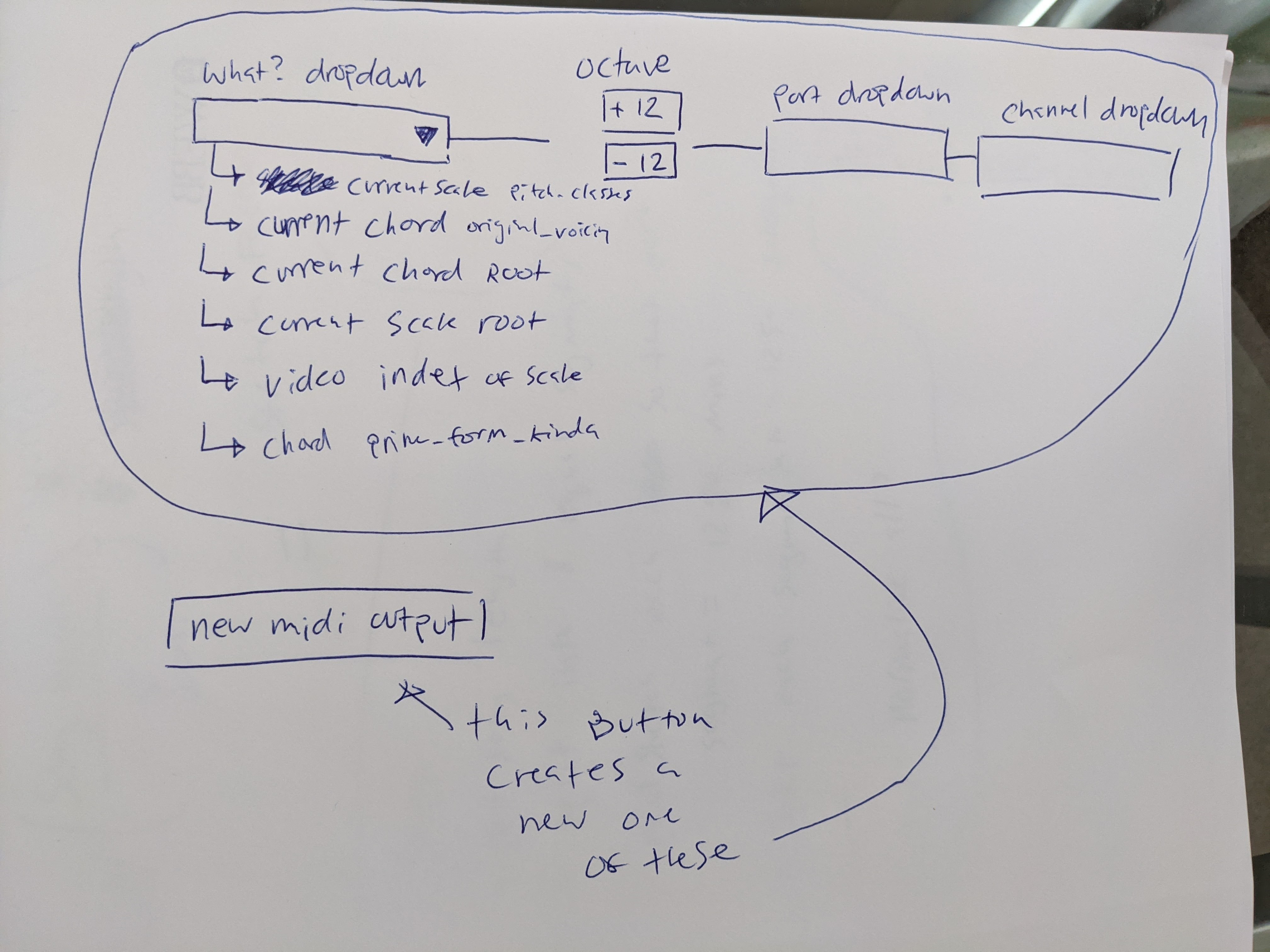
The MIDI-output wireframe: the UI shipped in 48 hours, the behavior took four years.
Final solution
Where harmony should live
Harmony should live at the center of your compositional and production workflow, not in a browser tab and not duplicated inside every plugin. So I rebuilt Dashboard as a VST3/AU plugin with automatable parameters: change the scale at bar 32 and the automation lane remembers. Every other Scale Navigator tool subscribes to that state, which makes Dashboard one interface that tells the rest of the session what the harmony is.
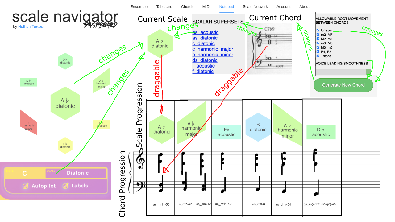

The 2021 Notepad wireframe, and the Score workspace that finally shipped it.


Visualization and Chord tabs: the 2020 instrument's controls survive, redesigned.


Tablature renders the harmony onto real instruments; Ensemble opens it to other players.
Some decisions stayed as toggles. Users gravitate toward the 3D layout, but the flat 2D layout reveals the circle of fifths as just one pathway through the larger network, so both remain. Early users expected clockwise rotation to mean flats; Tymoczko preferred the opposite; there's a toggle.


The iOS app carries the exploration side away from the computer.
Outcome
Since the iOS launch in March 2026: 272 downloads and a 12% App Store conversion rate, above the 75th percentile for music apps. Composer Miša Skalskis called it "probably the first midi generator that I actually enjoyed."
A moderated usability test in 2026 shaped the current onboarding work: the interface still assumes you already know what the shapes mean, and first-time users need a guided path that teaches the network by having them use it. That remains the open problem.
Demo: navigating the network and sending the harmony to the session.
Credits
Built on Dmitri Tymoczko's research (NIME 2019). Dexter Shepherd, Colin Honigman, and Nathan Ho mentored the first prototype; Michael Maurer shaped the early React architecture; Ondřej Sedláček, Netanel Ben, and Brady Boettcher contributed engineering; Jono Freeman, Dylan Freeman, and Jason Gardinier built the color and brand system; Lily Clark refined the 2026 identity; Arthur Carabott, Ben Tillotson, and Lachlan Turczan gave the critiques that shipped; Elvis Bates sat for usability testing. The app ships a full credits screen.
Related work
Tonalign — the same harmonic state, enforced on live MIDI
Ensemble Jammer — networked instruments that follow Dashboard's harmony
NotesChordScales — the inverse direction: play notes, and the system infers the harmony
SNaPS — a sampler that glides its samples to match the harmony